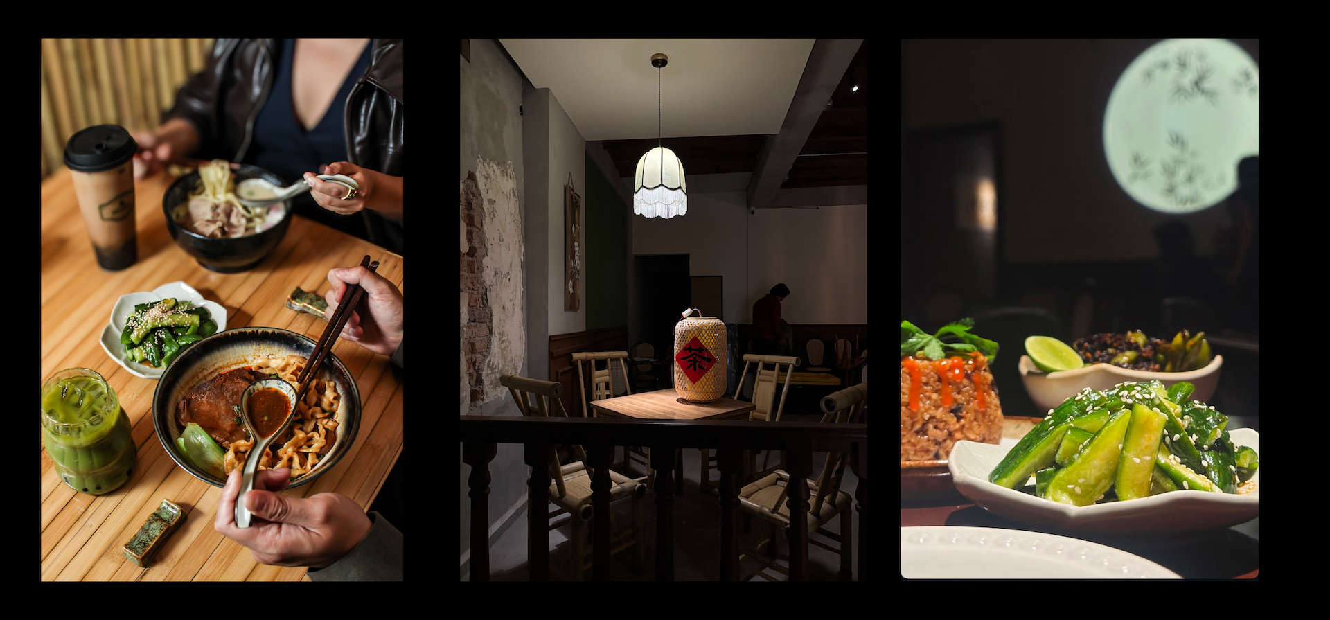
NUDO
Design-Led Business Growth
Project duration: 14 months
My Role: Co-founder & Designer (service design/user research/branding design/interior design).
01. Context - Solving the “Authenticity vs. Accessibiolity” Paradox
The Opportunity: Finding the Middle Ground
In Mexico City (CDMX), we observed that the Asian culinary landscape has two extremes:
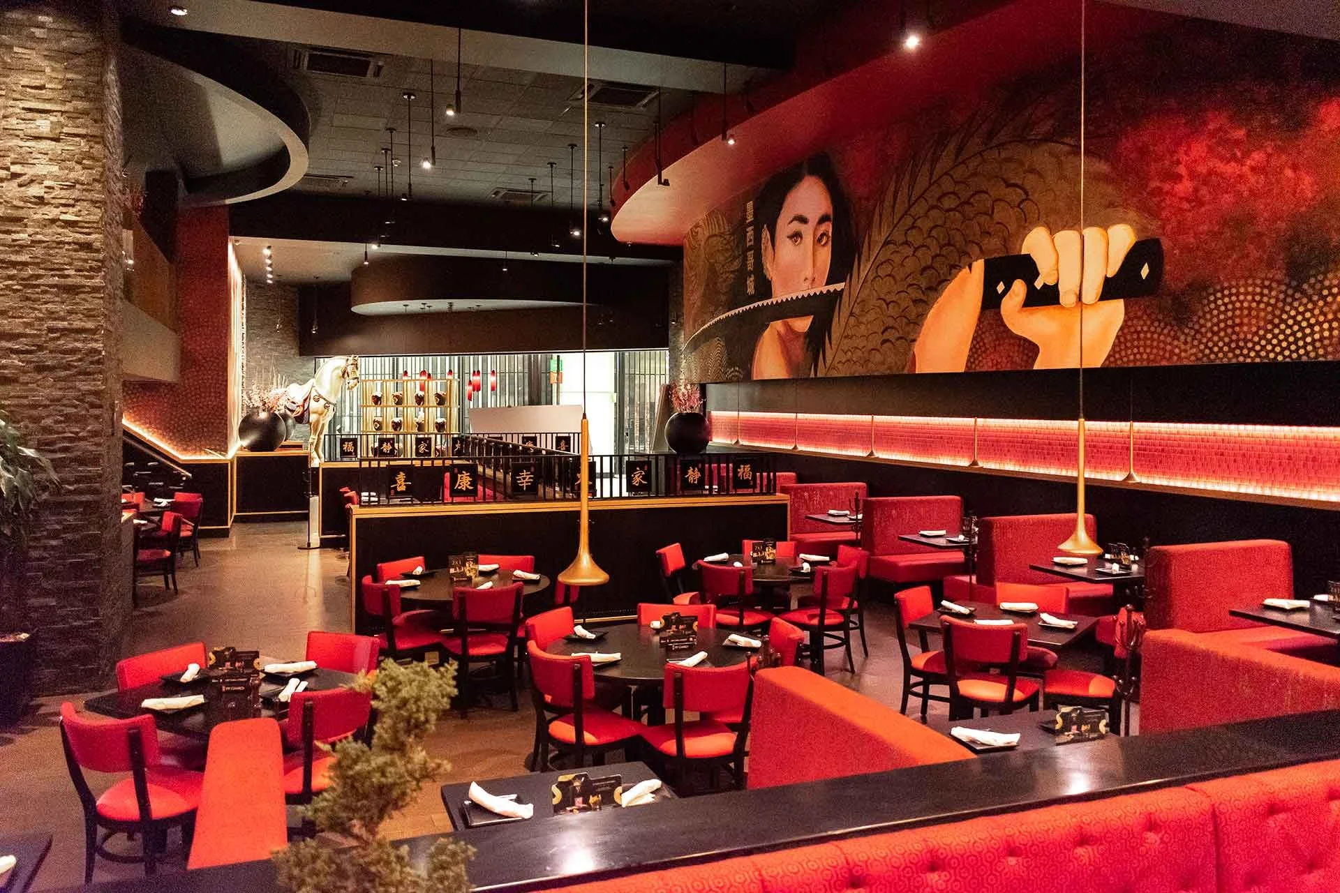
The "Westernized" High-End:
These venues offer polished environments and impeccable service that locals love, but the food is often a "diluted" version of Asian cuisine—expensive, over-simplified, and stripped of its traditional soul.
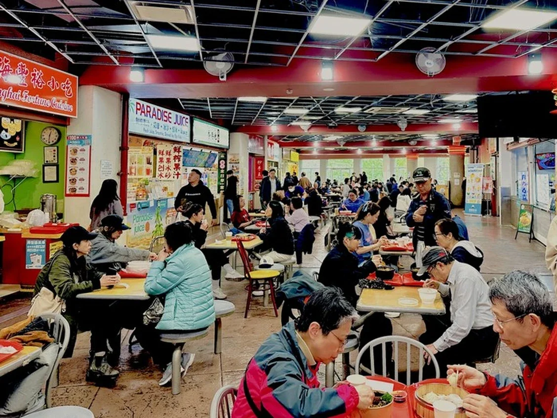
The "Authentic" Enclave
On the other end, truly authentic spots (especially traditional Chinese or regional noodle shops) remain inaccessible to the local Mexican community. While the food is genuine, the experience is often accompanied by poor service, neglected environments, and a lack of cultural "onboarding" for non-Asian guests.
We saw a massive market gap: the opportunity to create a space that offers uncompromisingly authentic Asian soul food within a sophisticated, service-oriented environment designed specifically for the local Mexican community.
The Concept: A Pan-Asian Gateway
Our vision was to create a "Curated Asian Hub"—a single destination where locals could explore the diverse culinary cultures of Asia (from the umami-rich Ramen of Asia to the vibrant Bubble Tea culture and beyond) without feeling like "outsiders." We wanted to prove that Authenticity does not have to be "unfriendly," and Accessibility does not have to mean "watered down."
Strategic Design Challenges
Cultural Onboarding & Translation: How do we present "extreme" or unfamiliar flavor profiles (fermented pastes, specific spices, textures) in a way that is adventurous yet approachable for the Mexican palate?
The Experience Hybrid: How do we design a service model that matches the hospitality expectations of CDMX (where service is warm and attentive) while maintaining the operational rigor of a high-volume Asian kitchen?
A Multi-Cultural Narrative: In a single physical space, how do we weave together different Asian culinary identities (Japanese Ramen vs. Taiwanese Boba) into one cohesive brand story that feels like a curated journey rather than a disjointed food court?
Design Objectives
Elevating the "Authentic" Experience: Redefining the "angry grandma" authentic meal into a premium, design-led experience.
Behavioral Comfort: Designing touchpoints that guide the local customers through the e2e experience, removing the "intimidation factor" of traditional Asian dining.
Operational Synergy: Balancing a ramen operation with a social, linger-friendly boba operation.
02. Behavioral Insights
Decoding the CDMX Dining DNA
Our research revealed that the primary challenge was not just culinary, but psychological. In Mexico City, we faced a "Cultural Perception Gap": while the local market was curious about Asian flavors, they were often paralyzed by the "fear of the unknown" or alienated by the lack of quality in existing mid-market options. To address this, we implemented three key strategic interventions:
The "Ramen" Halo Effect
We identified a significant value-perception barrier: in the local mind, the term "Noodles" was associated with cheap, generic snacks, whereas "Ramen" held a prestigious, artisanal status. To elevate our diverse Pan-Asian menu (which included Chinese, Thai, and Vietnamese recipes), we made the strategic decision to label every dish as a "Ramen." By anchoring unfamiliar flavors to a high-value category, we successfully lowered the "intimidation factor" and justified a premium price point, educating the market that the complexity of Japanese Ramen could be found across the entire Asian noodle spectrum.
From Fast Food to "Exotic Experience"
While Ramen is traditionally a high-velocity "functional" meal in Asia, our behavioral audit showed that Mexican diners perceive it as a premium, exotic experience. The local ritual of Sobremesa—lingering over a meal for social connection—contradicted the typical "eat-and-go" ramen model. We leaned into this by designing an atmosphere that favored "Date-Night" intimacy over canteen-style efficiency. To support this longer dwell time, we introduced a "Boba-Tea Premium" strategy. By providing authentic, high-quality Asian milk tea—a product whose quality was previously unavailable in the local market—we gave customers a reason to extend their visit, transforming a quick bowl of noodles into a multi-stage social event.
Engineering Trust
To mitigate the risk of "ordering wrong"—a major friction point for local Mexicans—we built a multi-layered trust ecosystem.
We treated our social media as an educational "onboarding" platform, using high-end photography and storytelling to demystify ingredients before the guest ever arrived.
Inside the space, we implemented a Bimodal UX: a minimalist paper menu for speed, and a QR-based digital menu for visual reassurance. Finally, we introduced a "Broth Sampling" protocol, allowing hesitant guests to "test-drive" intense flavors before committing. These interventions successfully reduced cognitive load and converted "anxious first-timers" into "confident regulars," proving that authenticity is most effective when it is intentionally accessible.
03. Spatial Strategy: Mapping the Service Journey
Service Design Blue Print
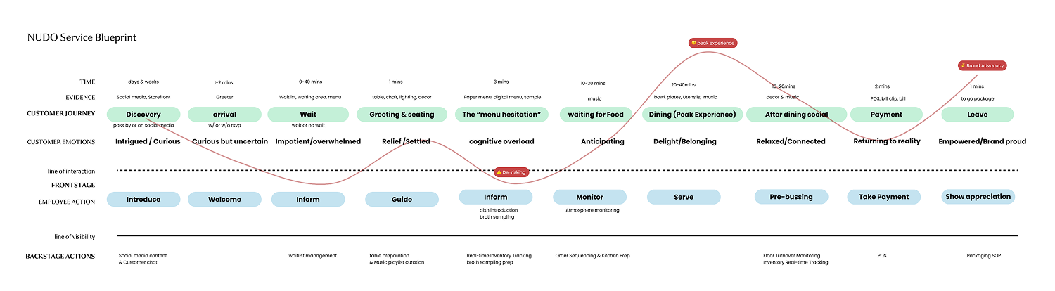
I hosted the customer experience workshop within the founder team and we built the service design blueprint. This Service Blueprint is not just a process map; it is a systematic framework designed to help the team to put ourselves in the customers’ shoes, and creates, stabilize and replicate the "Sanctuary" experience. It bridges the gap between the brand’s high-concept identity and the operational reality of a high-density restaurant in Mexico City.
Directing the Spatial Narrative
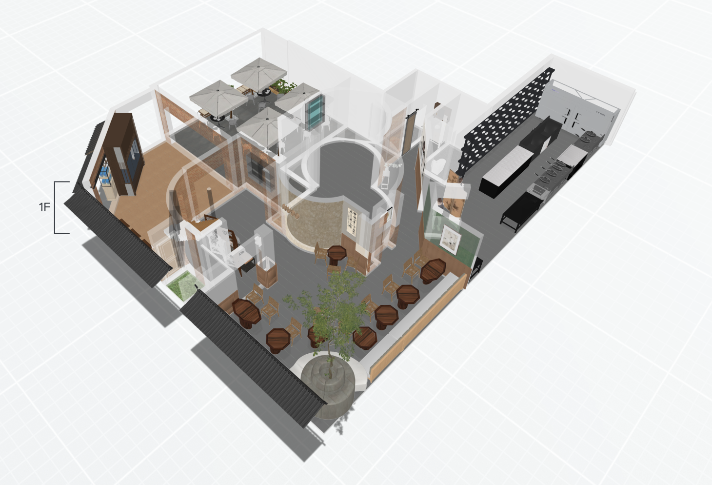
NUDO 2 first floor interior design concept
As the designer for both the brand and the physical space, I ensured that every physical detail—from the custom Chinese lattice fretwork to the precision spotlighting to the jasmine tea scents—was designed to show authentic Asian heritage and engineered to facilitate our service protocols. By controlling the interior design, I was able to transform the physical environment into a 'Sanctuary' that guides the customer's emotional journey from the moment they step off the street.
Boba bar as the storefront
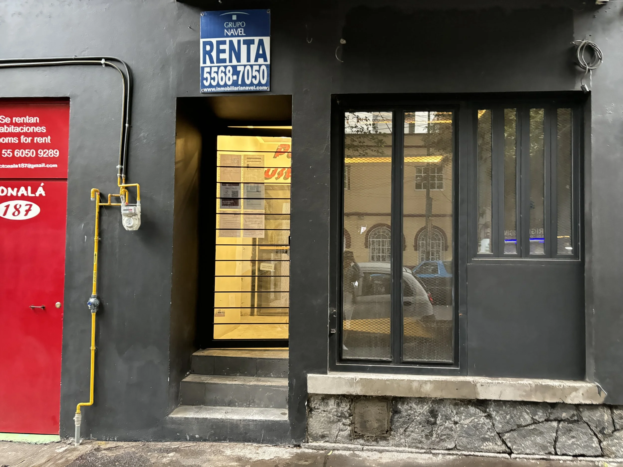
NUDO 1 before
NUDO 1’s storefront is compact and tucked away, creating a high mental barrier for passersby who might not realize this is a restaurant. To lower the entry barrier, we decoupled the beverage experience from the formal dining experience.
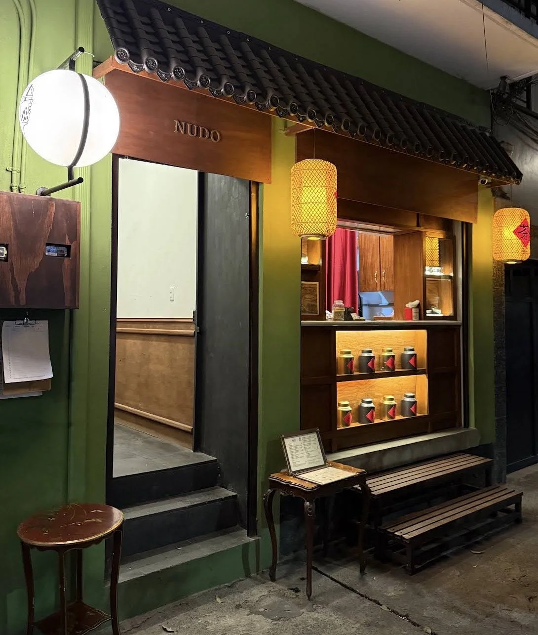
NUDO 1 after
The Interaction: We designed a high-aesthetic, street-facing Boba Bar that serves as the brand’s "Social Face." Featuring curated Asian artifacts and displays of premium loose-leaf tea cans, it functions as a high-conversion visual anchor.
Psychological De-risking: By creating this dedicated counter, we eliminated the "Ordering Anxiety" of locals who might feel intimidated entering a full-service Asian restaurant just for a drink.
Logistical Efficiency: This bar also serves as to-go order and the dedicated pickup point for delivery couriers, preventing the "flow friction" among kitchen staff, boba bar staff, dine-in guests, boba only guests and uber drivers.
04. Visual Identity & Multi-Sensory Branding
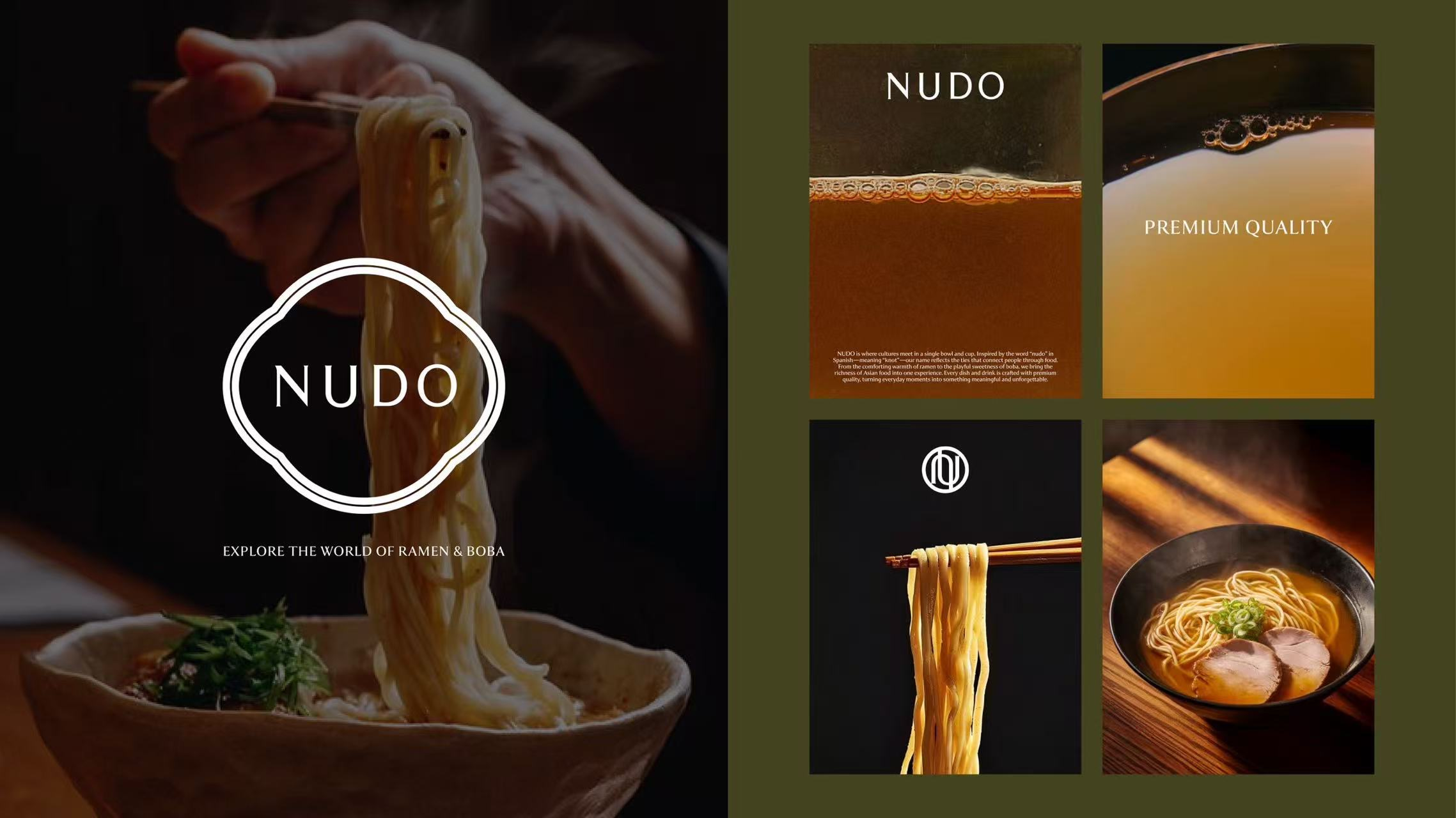
Our goal was to balance Asian heritage with local recognition. We realized that many traditional Asian symbols are not immediately recognized by the Mexican public, or can be misinterpreted. To bridge this gap, we conducted local surveys to identify which fonts, graphic patterns, and floral elements truly signaled "Authentic Asia" to a Mexican audience.
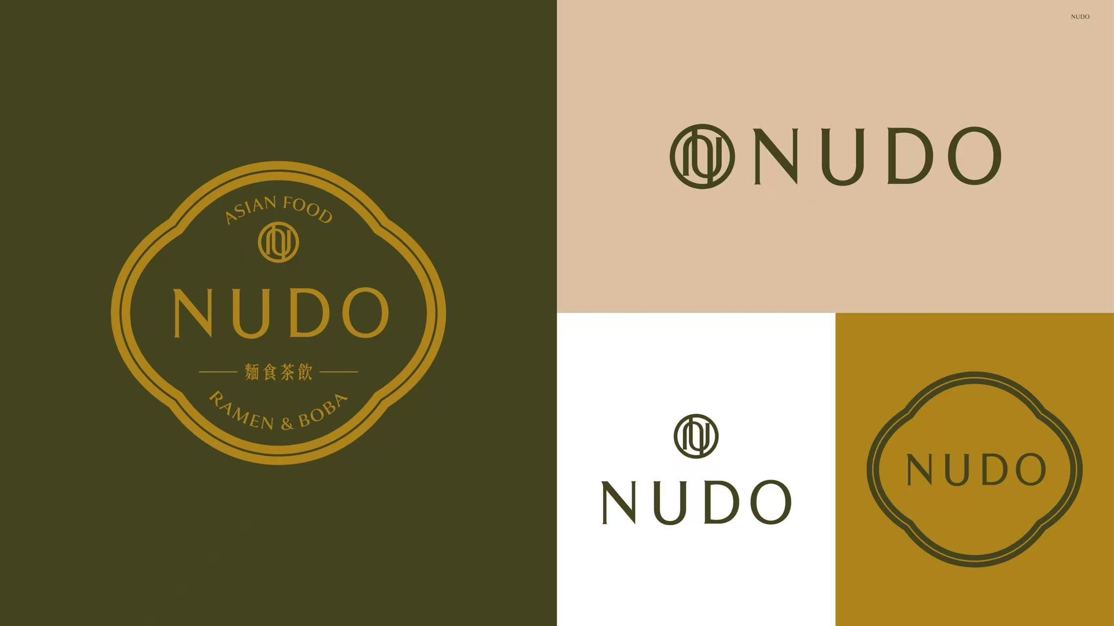
The "Recognition" Strategy: we used a curated visual language—clean typography and specific Chinese lattice windows—that the local community perceived as "High-end Asian," ensuring the brand felt both authentic to us and approachable to them.
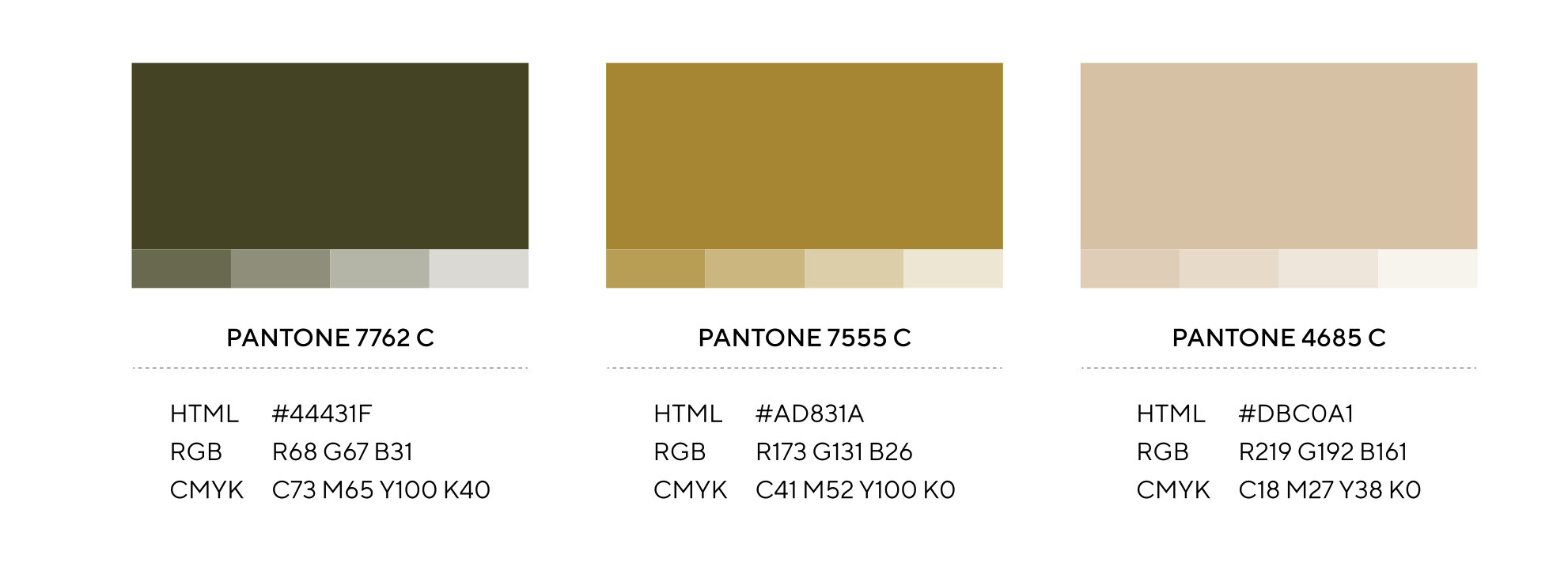
The Palette:
Moving Beyond "Red": While red is the most common color in Asian culture, we deliberately avoided it to distance ourselves from "fast-food" stereotypes. Instead, we developed a more sophisticated, organic palette:
Deep Forest Green: Represents nature, freshness, and the premium quality of our tea.
Gold Accents: Adds a layer of "Premium Craftsmanship" and elegance.
Earthly beige: Connects the brand to organic ingredients and provides a grounded, "warm" feeling.
we successfully positioned the brand as a high-taste, organic, and artisanal destination rather than a typical commercial franchise.
Lightning & Decoration - Turning Constraints into Intimacy
NUDO 1 interior
Our first location faced a major architectural challenge: a small, narrow footprint with zero natural light, which initially felt cold and cramped. Instead of trying to brighten the space, we leaned into the darkness to create an "Intimate Asian Sanctuary."
The "Vanishing Wall" Strategy: We used a dark interior palette to make the physical boundaries of the room disappear. This depth created a sense of mystery rather than confinement, making the small space feel intentionally private.
Spotlight UX: We placed precise spotlights over each table and each art piece. This creates a private world for the diners, guides their eyes on the food, each other and the art pieces in the space while visually tuning out the surrounding crowds and noise. These illuminated focal points reinforce our "Premium Asian" brand identity.
Packaging as a Strategic Branding Tool
We treated our packaging as a "Walking Billboard" to capture the high-mobility Boba market in Mexico City.
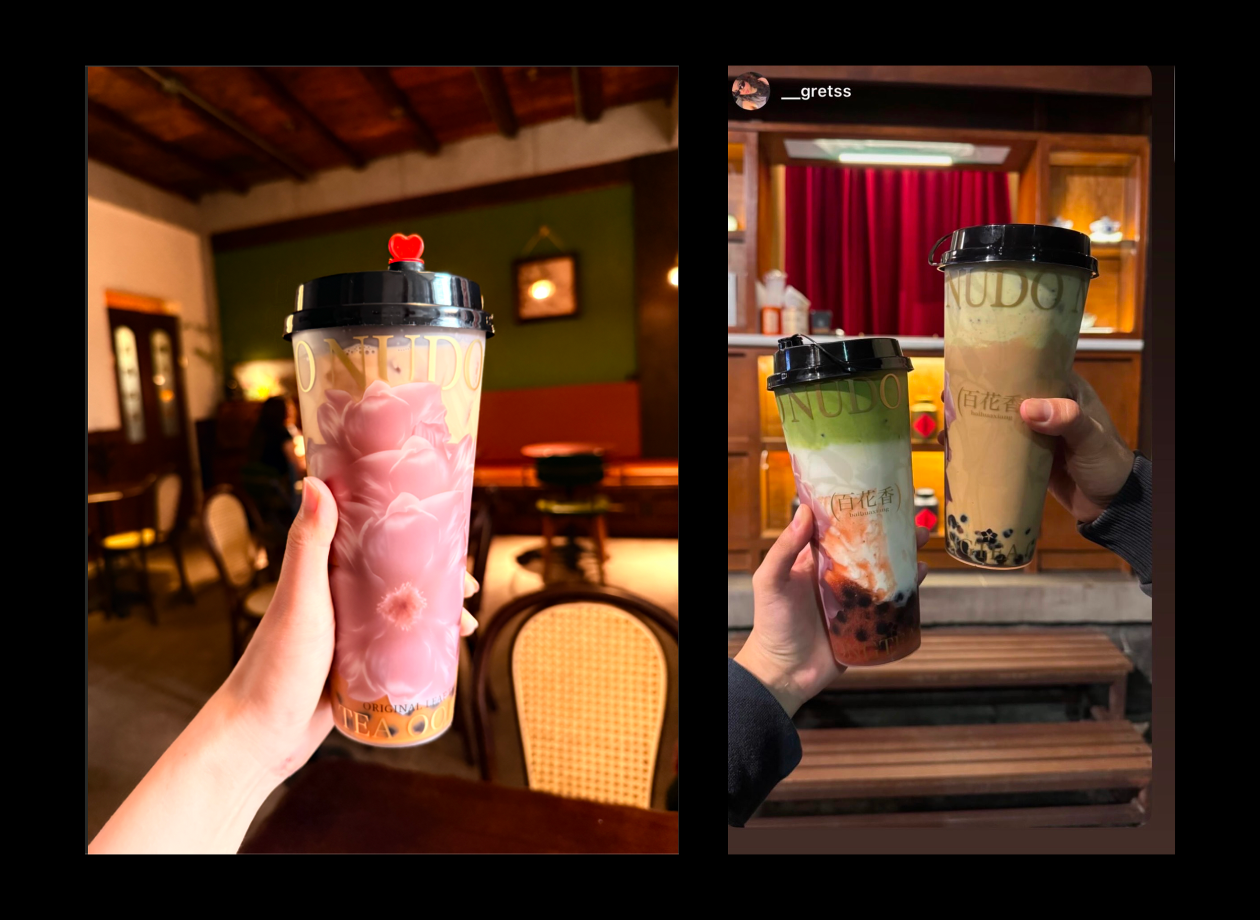
Visual Impact
Unlike the popular minimalist style, our packaging features a bold, high-impact visual style. This flamboyant aesthetic was designed to be "Social media-first," successfully turning our bags and cups into the brand's most viral assets.
The "Orientation" Protocol
To maximize street-level exposure, we implemented a specific service rule: staff must align the lid so the drinking hole is opposite the primary brand graphic. This ensures that while the customer is drinking, the best-looking side of the cup is always facing the public, not the user.
Investing in Quality
We used premium material though with higher costs to establish a "Top Quality" benchmark. This immediately differentiated us from local low-cost competitors.
05. Systematizing the Experience: Scalability
Designing for the "Multi-Unit" Future: Scalability as a Core Principle
From day one, our design was never about a single successful site; it was about building a scalable business engine capable of expanding to 10+ locations without compromising quality or requiring manual oversight of every detail.
Macro-Scalability Thinking: We anticipated the "Operational Nightmare" of multi-unit management early on. To prevent this, every touchpoint was engineered to be self-sustaining and process-driven, ensuring that the brand’s soul remains intact whether owners are on-site or not.
The "Zero-Friction" SOPs: Our SOPs were designed to be executed with ease. Whether it is the exact lux level of lighting, the orientation of a cup lid, or the precise plating of a ramen bowl, we simplified complex tasks into "no-brainer" steps.
Consistency Across Borders: We invested heavily in automated consistency. From centralized broth production to automated kitchen timers, we ensured that a bowl of ramen in Branch #1 tastes and looks identical to one in Branch #10.
The "Plug-and-Play" Business: By removing the dependency on individual "genius" or constant founder intervention, we transformed a passion project into a business system so robust that it could be operated efficiently by anyone, anywhere.
06. Result: Design-led business growth
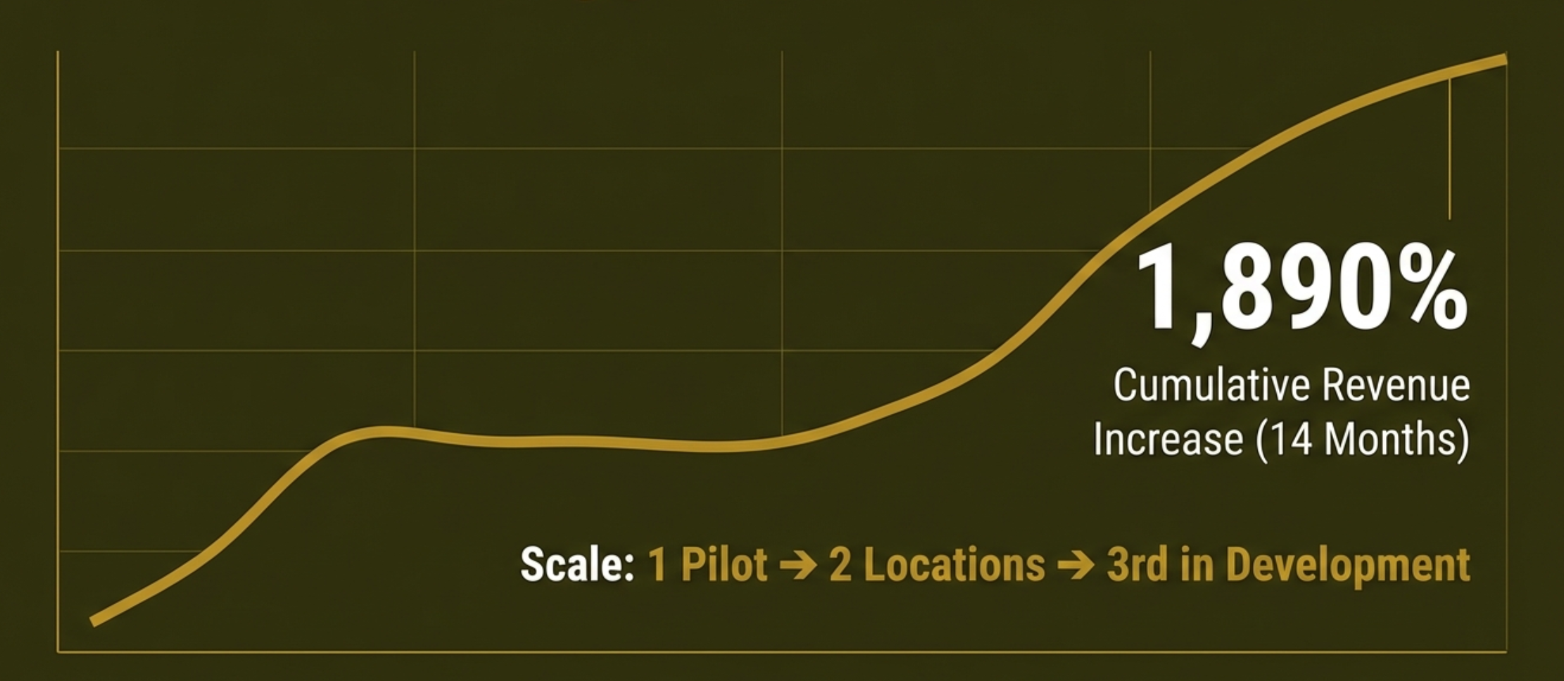
Revenue Leader:
From a pilot site to a market leader: We achieved a 1,890% cumulative revenue increase within the first 14 months, scaling from one prototype to two high-performing locations with a third in active development.
Viral Growth:
Established NUDO as a Asian dining benchmark in Mexico City , achieving viral social media success, and has grown from a single to multi-location operations."
Social Proof:
Maintained a consistent 4.6-star rating on Google Maps, reflecting high customer satisfaction across food quality, service, and dining experience.
NUDO taught me that great design isn't just about pixels on screens; it's about building a sustainable business engine that can scale across physical borders and cultural gaps.
There are countless micro-decisions and iterations behind NUDO that cannot be fully captured on a single page here. I invite further discussion on the specific operational challenges and design trade-offs encountered during the execution of this project.