Billing & subscription
design system
Design system
2020
Project Overview
Currently, billing team owes more than 100 Zeplin projects and they are based on new feature release. This makes it hard for all the team members to find the latest design. And often as designers, we have to recreate a lot of the screens and it results in inconsistency.
Billing has lots of unique use cases that are not covered by QuickBooks Design System or other product, so the purpose of this initiative is to provide a one source of truth for billing and subscription customer experience.
Ideally, I would like the billing design system to be a sub library living inside of QuickBooks design system. This is ongoing effort for the billing team.
My role
I led the initiative and partnered with content designers, product managers, and product development team.
Card
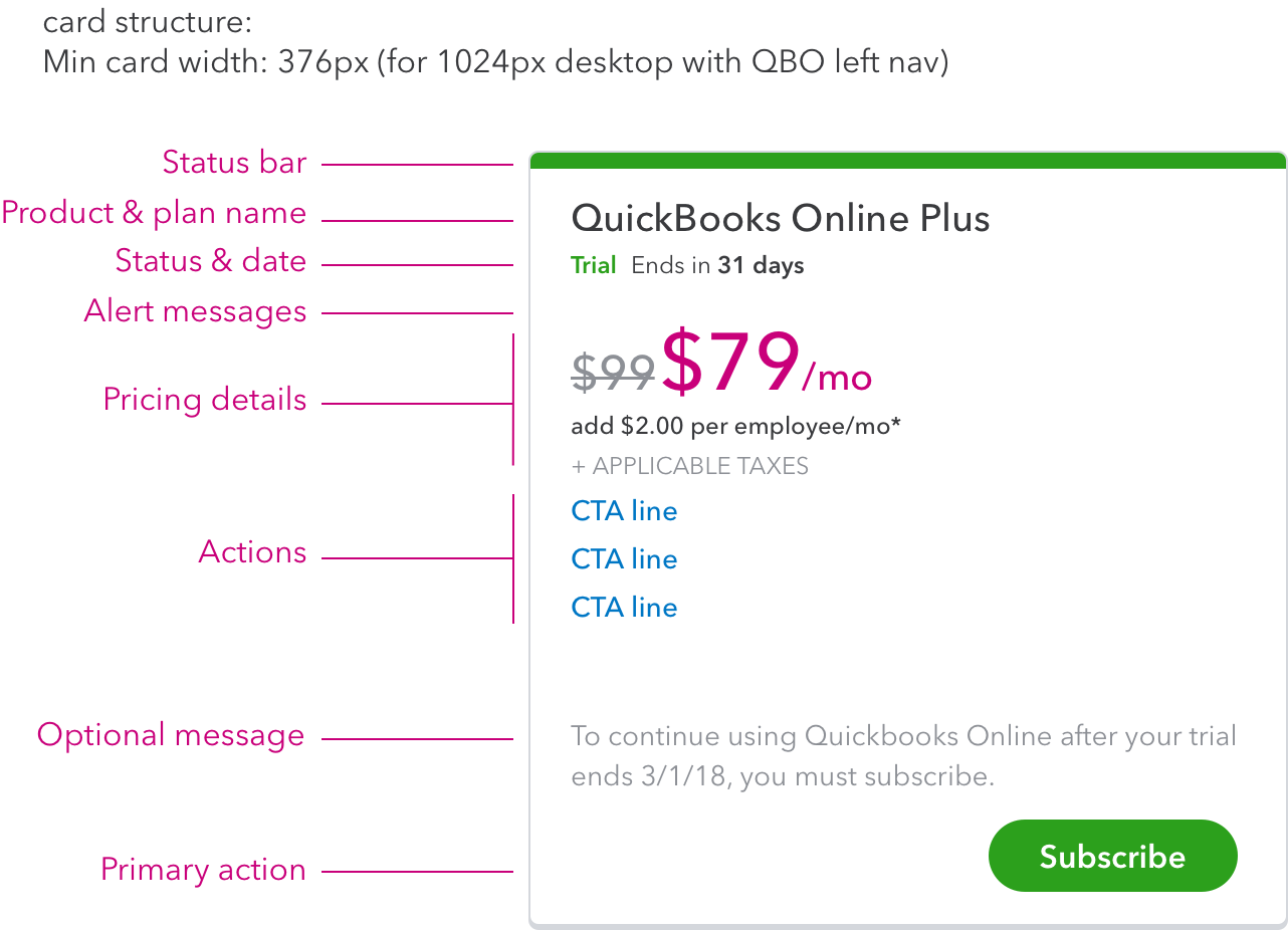
Card is the most important and most used component for billing and subscription. Every product subscription is represented by a card.
Then I defined interaction, visual, content (partnered with content designer) of each element.
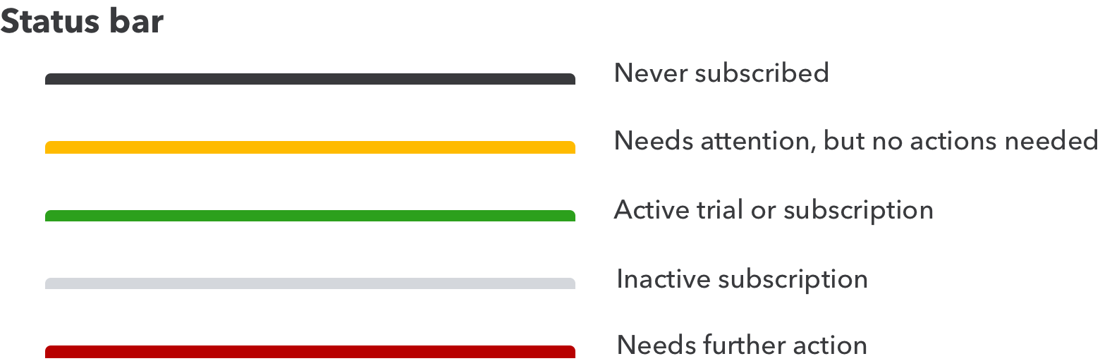

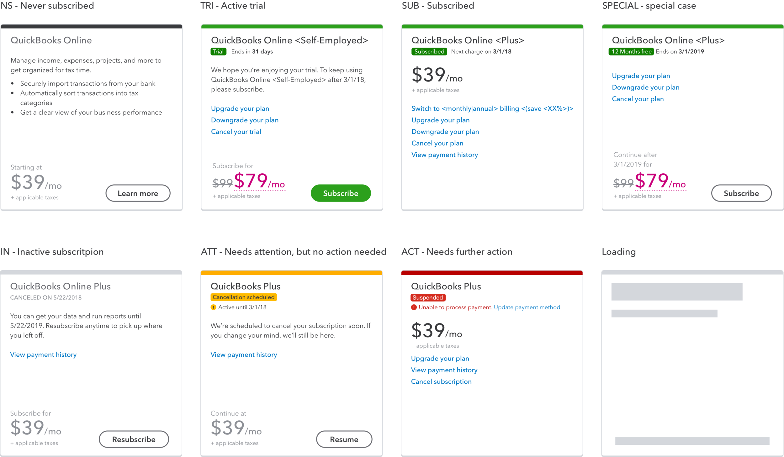
Here are some example cards for different status using the same product. All the other products/SKU should follow this as well. I also created a card library that covers most of our main product, so that it's easier to grab and use for designers.
Pricing
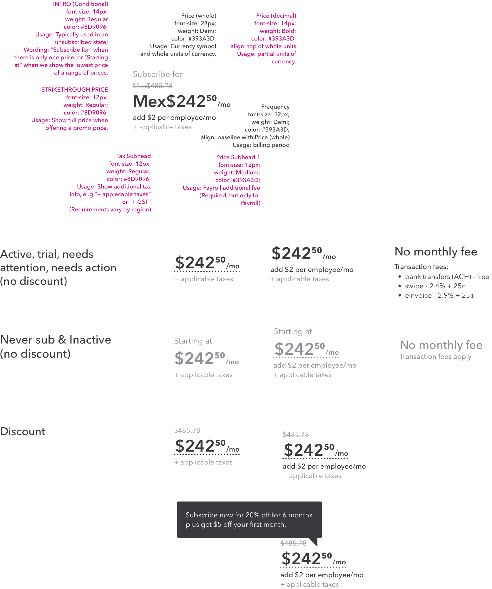
Pricing location:
Pricing is not always available. When it is available, its location depends on the state of the subscription:
• Subscribed (including needs attention and needs action): When subscribed, pricing is just below the status, near the top of the card.
• Not subscribed (including never subscribed, pending subscription, pending cancel, canceled, and trial): pricing is near the bottom of the card, near the CTA button.
Pricing color:
Pricing color varies by subscription status, and also if a discount is applied.
Accessibility:
Strikethrough is ignored by screen readers. strikethrough pricing should be read as “Was $99 now $79”
On-hover link for discount price needs to be in the tab order.
Button
Pricing location
Pricing is not always available. When it is available, its location depends on the state of the subscription:
Subscribed (including needs attention and needs action)
When subscribed, pricing is just below the status, near the top of the card.
Not subscribed (including never subscribed, pending subscription, pending cancel, canceled, and trial)
pricing is near the bottom of the card, near the CTA button.
Pricing color:
Pricing color varies by subscription status, and also if a discount is applied.
Accessibility
Strikethrough is ignored by screen readers. strikethrough pricing should be read as “Was $99 now $79”
On-hover link for discount price needs to be in the tab order.
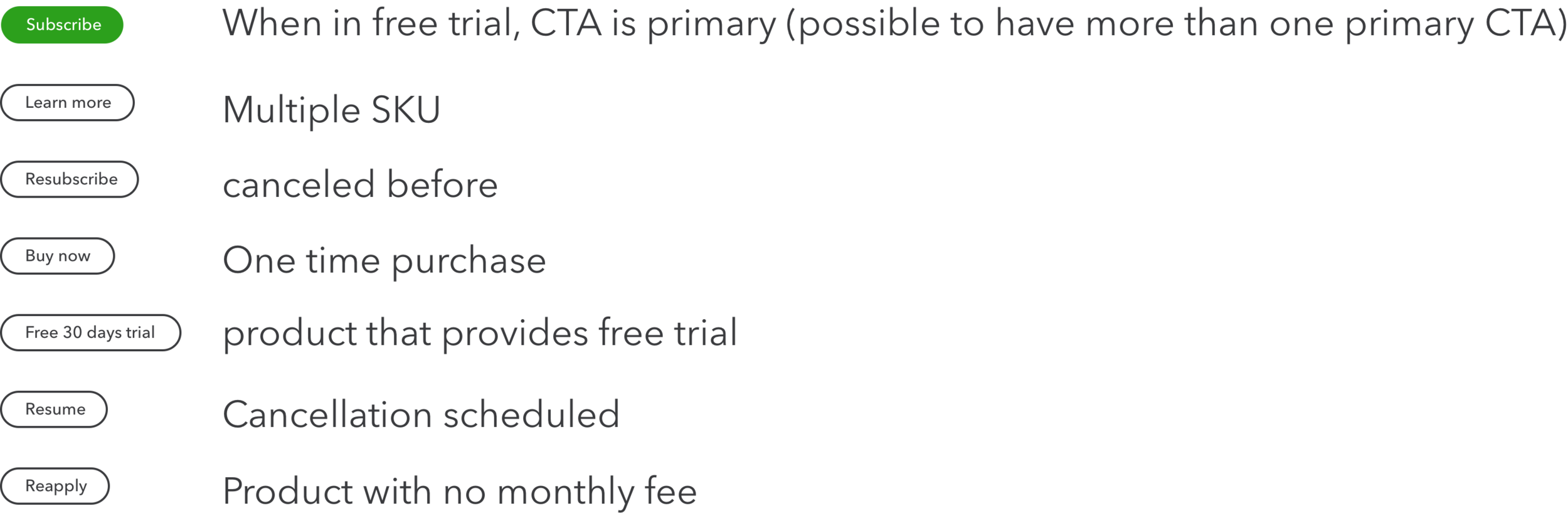
CTA links
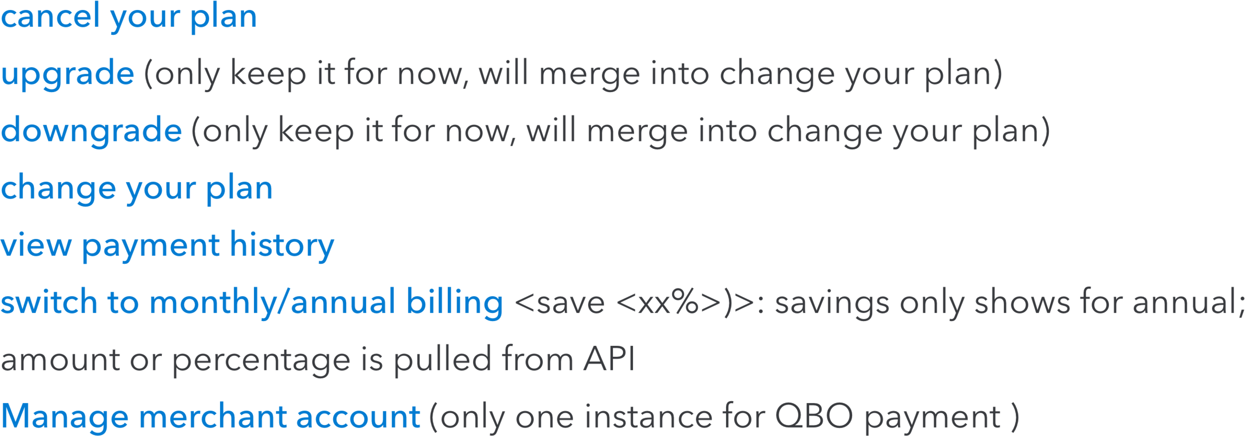
CTAs are dynamically generated, and may depend on SKU, locale etc. The maximum numbers of the CTA link is 3. (ideal state after we merge upgrade/downgrade your plan to change your plan)
CTA link on status line

Errors
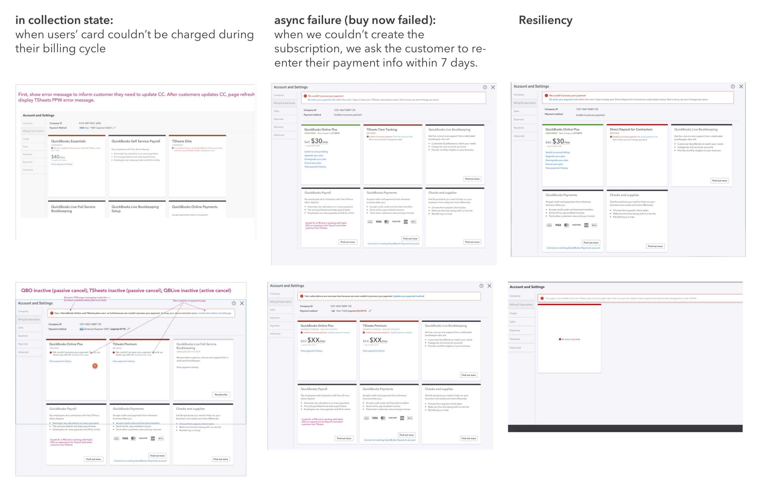
I did an audit of the current error message, figured we have more than 200 kinds of error messages showing up in different places in the product. (will not add it here to make it look too dramatic). So we standardized the error messages to 7, partnered with content designer.